
Redesigning my Website with AI
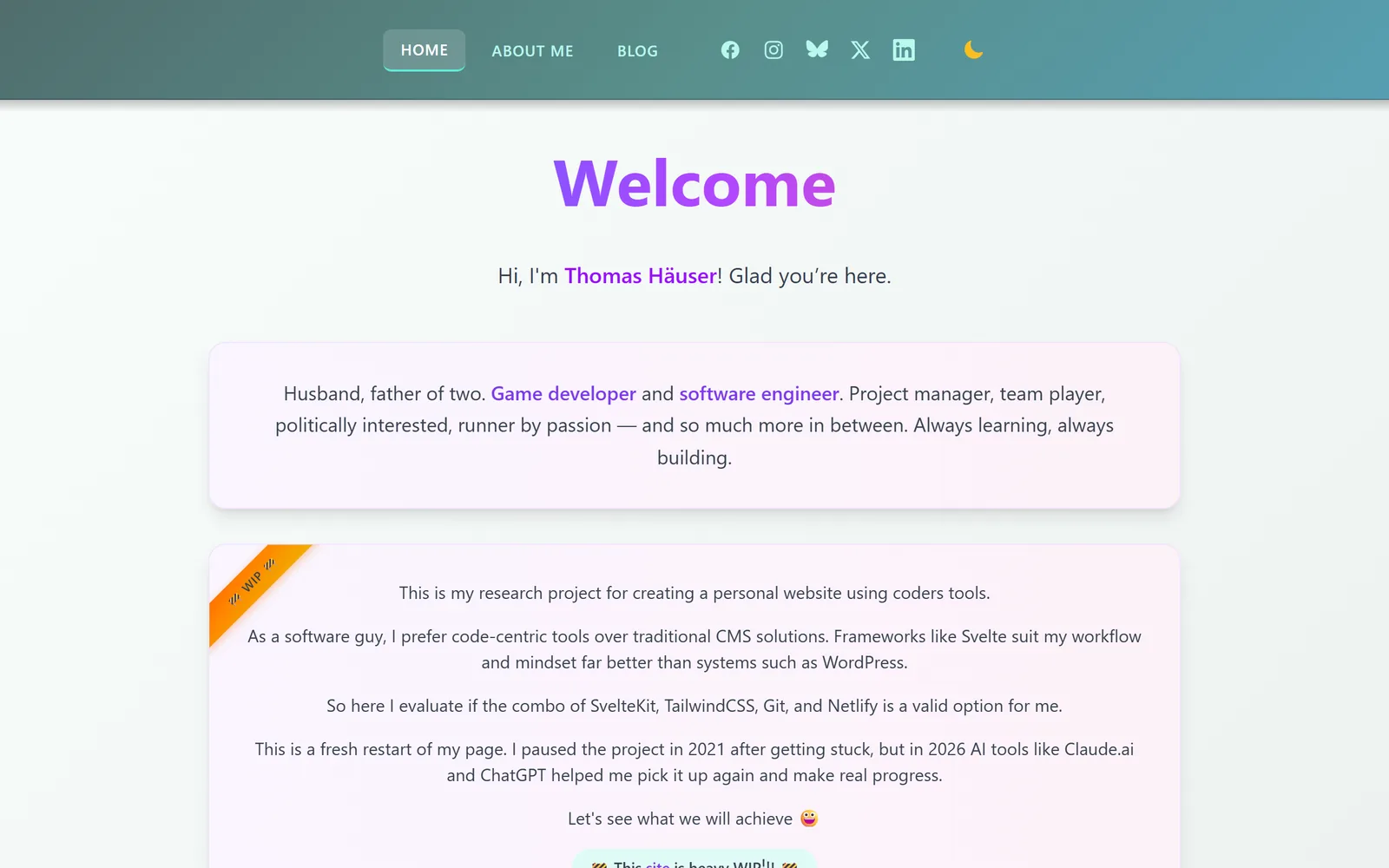
In January I restarted this website with the help of AI. It worked, and the site grew: a blog, a list of the games I worked on, pages about energy, politics and more. But it still looked like what it was — a research project with a big “Welcome” and a “WIP” ribbon.
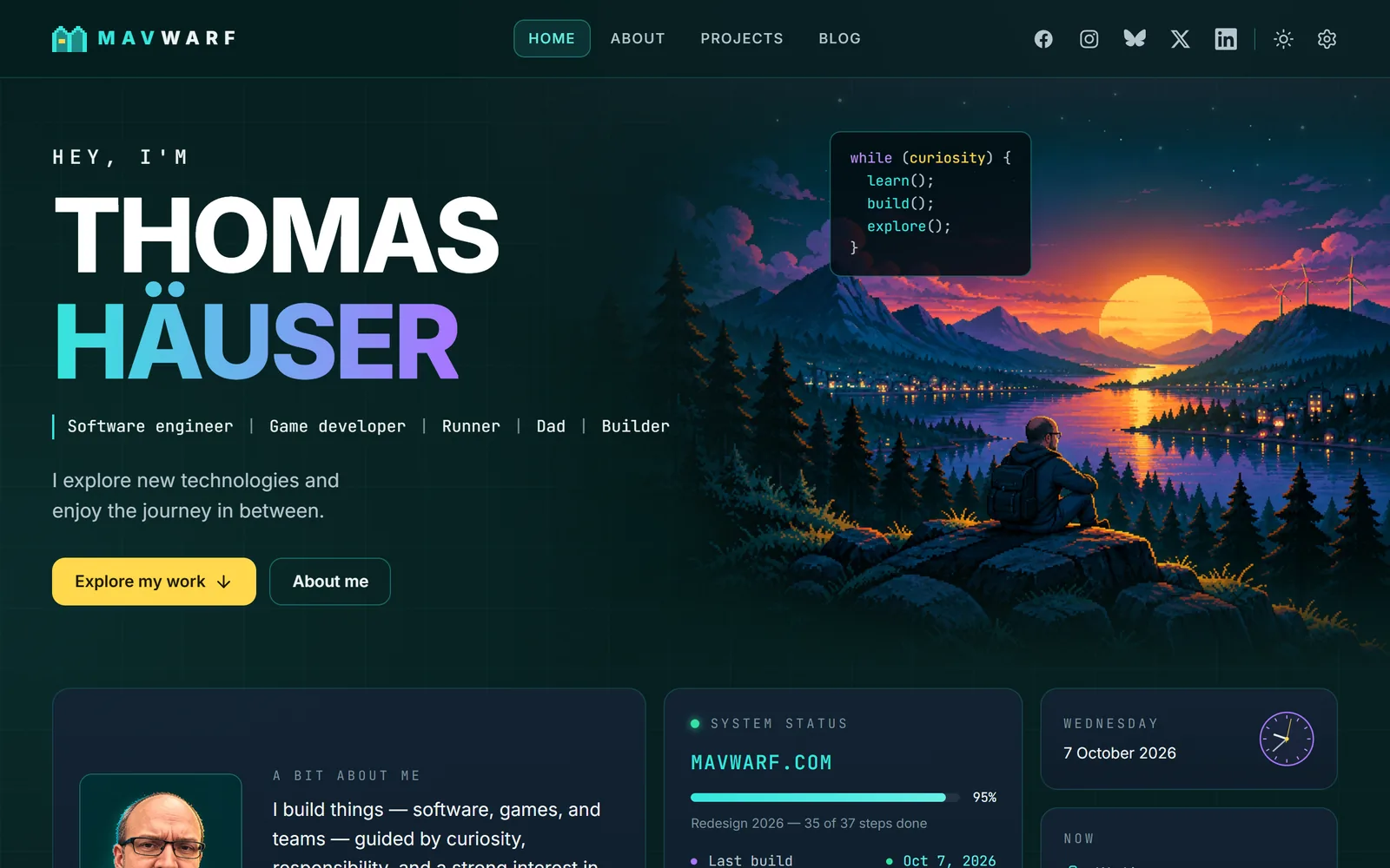
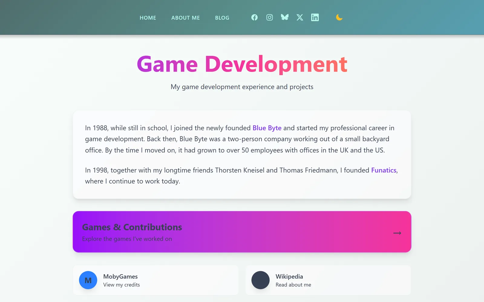
Eight months later it has a completely new look. This post is about why I did it, how it was made and what changed. With pictures, because nothing explains a redesign better than before and after.
Why a redesign?
The old site did not say who I am. The home page welcomed you and then talked about the website itself. Now a visitor should see within a few seconds who I am, what I do and what I care about.
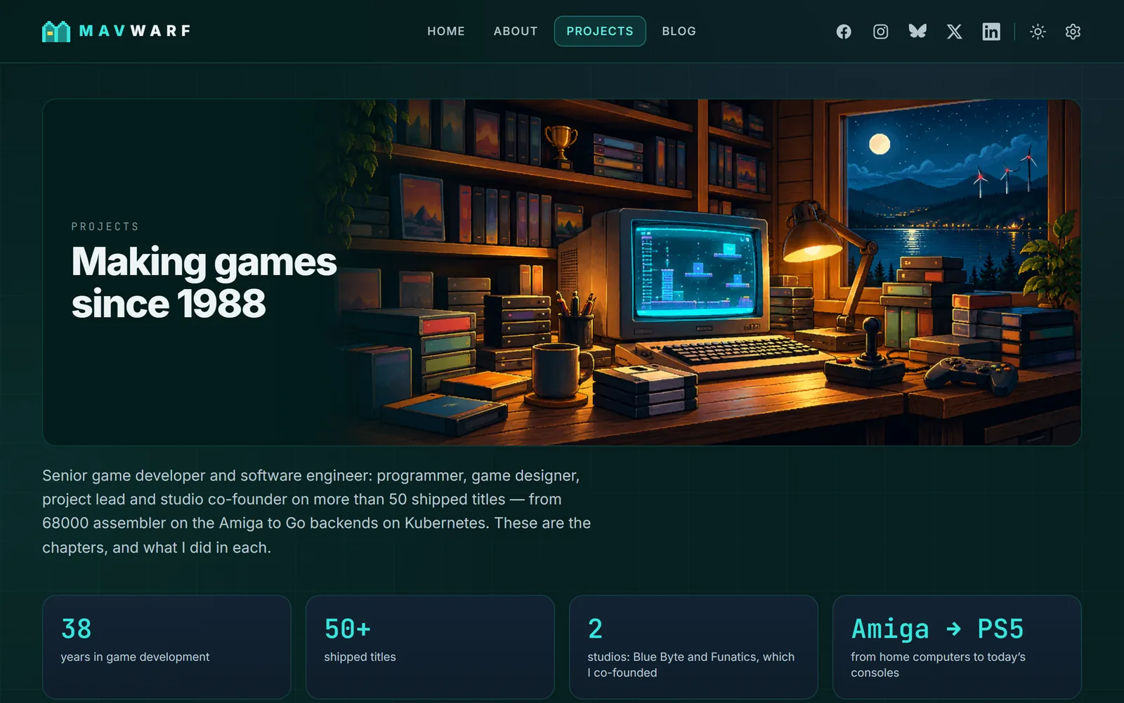
My story was hidden. I have been making games since 1988, first at Blue Byte, then at Funatics, which I co-founded. On the old site that story was two paragraphs above a long list. The new Projects page tells it in chapters, from assembler on the Amiga to today’s console titles.
No template look. I did not want a portfolio that looks like a thousand others. The site should feel like my own place, with room to play: pixel-art landscapes, a small code card, wind turbines with blinking lights.
It is still my playground. This website has always been a research project for me — first for the tools, then for building with AI. A complete redesign was the next experiment: can AI carry all of it, from the concept to the pictures to the code?
How it was made
Three steps, two AIs:
- ChatGPT wrote the concept. I asked for a redesign concept and a mockup. The result: a dark “developer world” in teal, with a big typographic hero, landscapes and cards for everything I do.
- Claude Code made the plan and built it. Decisions, a list of pictures to make, phases — all on a branch of its own, so the live site stayed untouched until the new one was ready. I gave feedback in short messages; Claude built, checked and committed step by step.
- ChatGPT painted the pictures. Claude wrote the prompts, I generated the pictures and dropped them into a folder, and Claude checked each one and built it in. More than two dozen illustrations came together this way.
From the first plan to this post it took less than two weeks and more than 30 commits.
Not everything worked at the first try:
- Pixel art from an image generator is not on a pixel grid. For the logo that mattered. In the end Claude drew it on a grid of 16 × 16 cells: two little houses under a roof line that forms an M. “Häuser” is the German word for houses. The first idea, a robot, did not make it.
- The first cabin in the footer had a smoking chimney. Not in my world. It has a solar roof now, and the car charges at the wallbox.
- The red lights of the wind turbines sat on the tips of the blades. They belong on the hub. So they were taken out of the pictures and added in code, where they can blink.
What changed
The home page now starts with my name and what I do, followed by selected work, the things I care about and the latest posts. A small “System status” card shows real data: the last build, the visitors, the number of posts.
Every section has a picture of its own, and the blog has covers by topic:
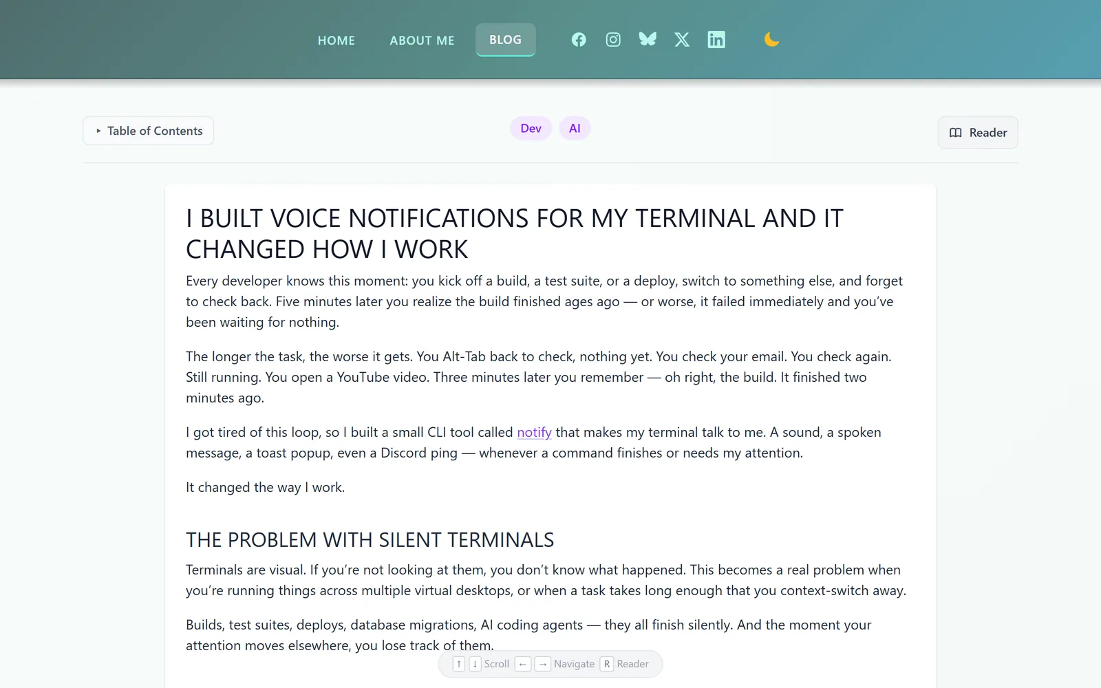
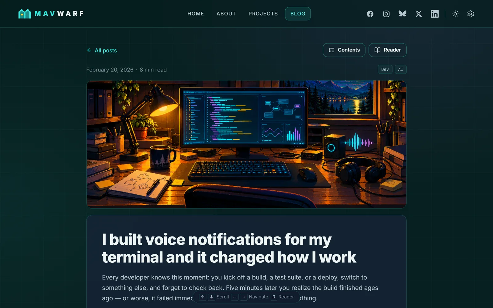
Even getting lost looks better now:
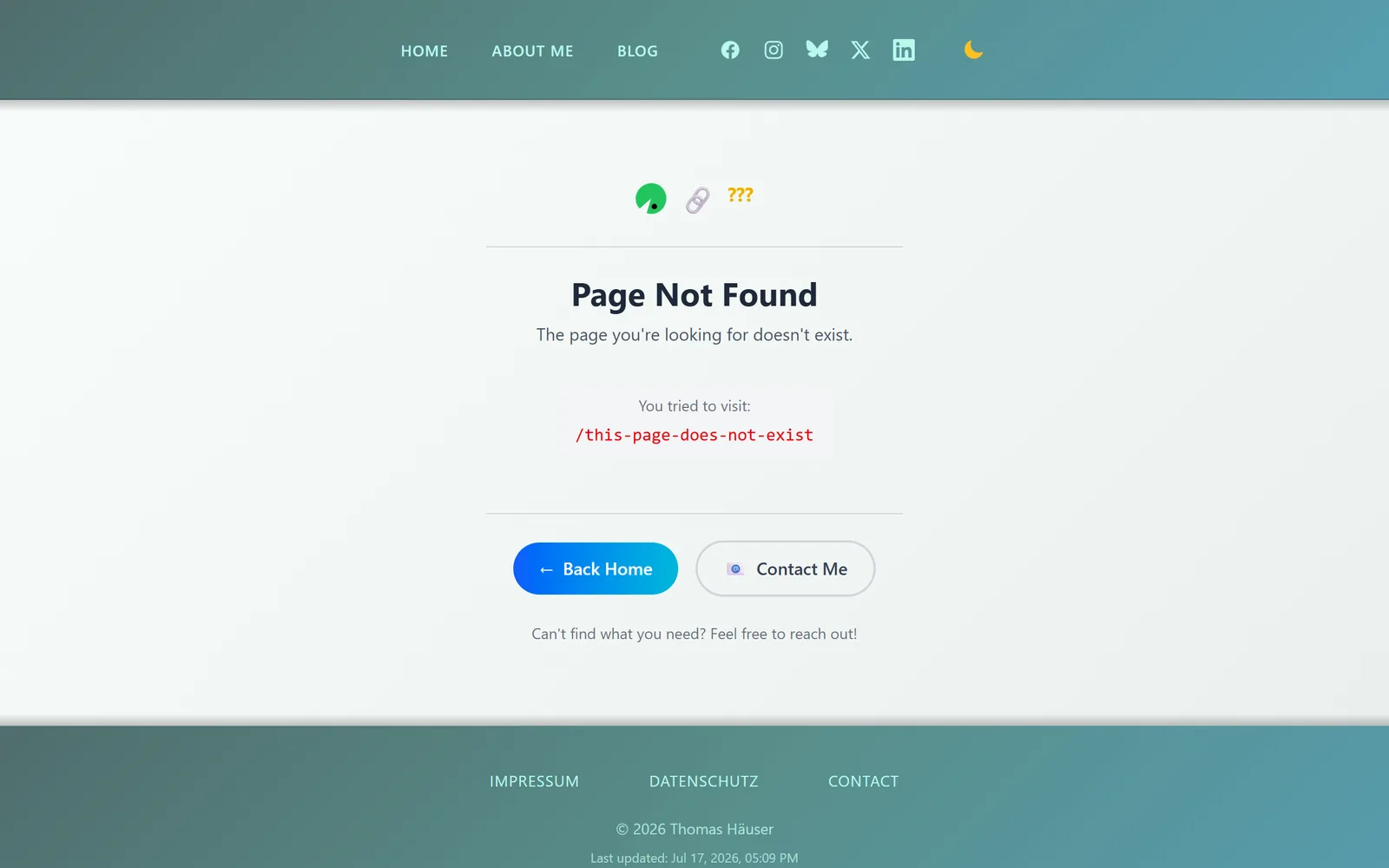
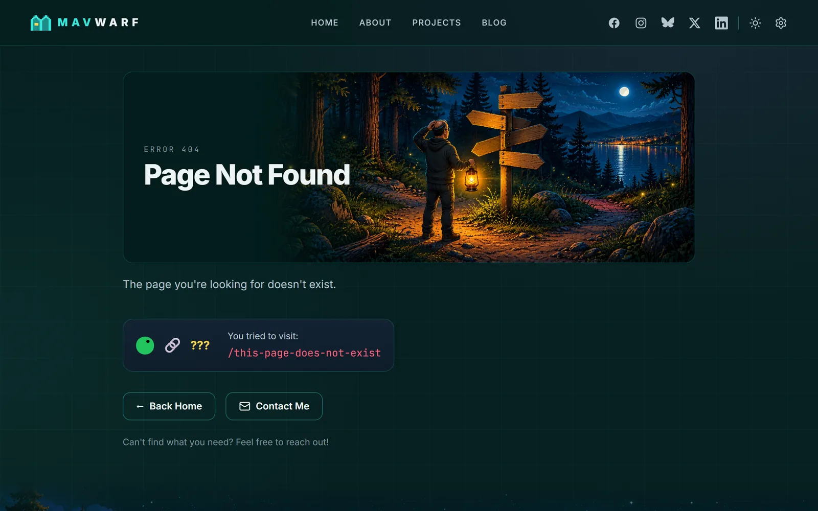
And the phone version is no longer a shrunken desktop page, it has a layout of its own:
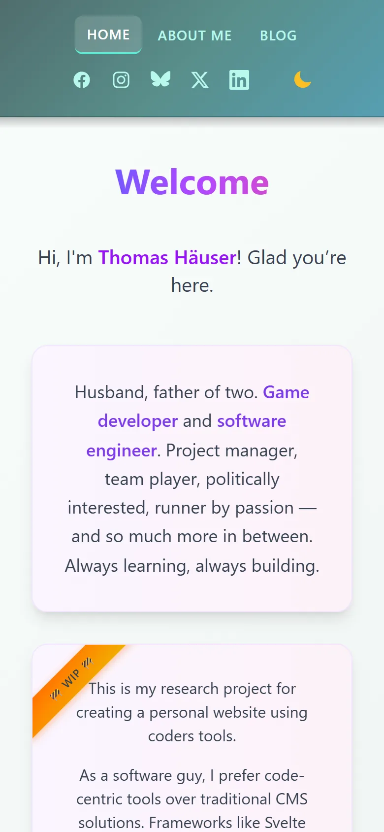
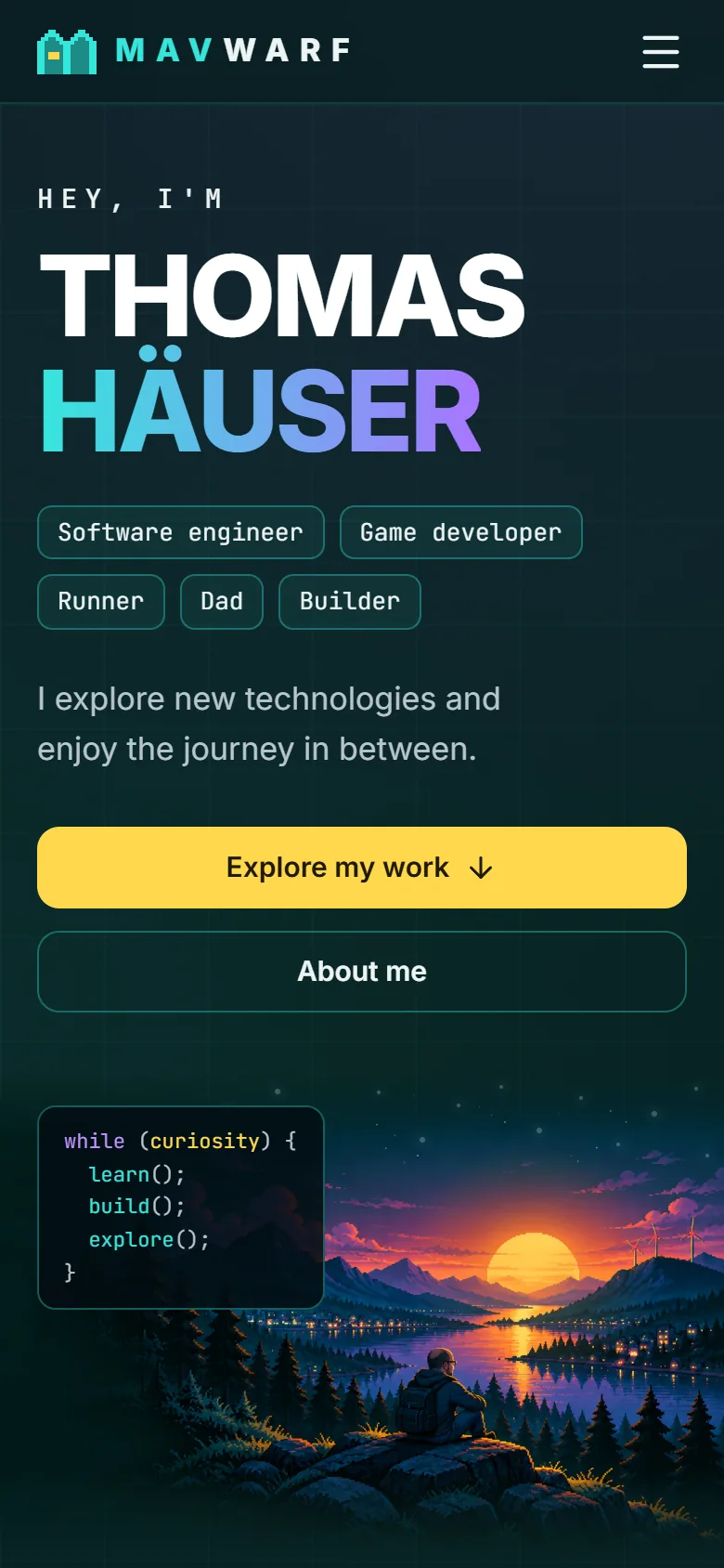
What stayed
- The stack. SvelteKit, Tailwind, Markdown for the posts, Netlify. This was a redesign, not a rewrite.
- The pages and their addresses. Only the Game Development page moved: it is part of Projects now, and its old address leads there. And my test post from 2021 has retired.
- The playground. The 18 colour schemes and 12 fonts of the old site are still there, behind the gear in the header. I liked them too much to let them go. Light mode is in there as well.
- The easter eggs. There are a few. One of them answers to a famous cheat code.
Under the hood
- Most pages are built once and served as ready-made files instead of being put together for every visit.
- Pictures come in modern formats and several sizes, so a phone loads a small one.
- The site can be used with the keyboard, keeps an eye on contrast and holds still for visitors who prefer less motion.
- Measured on my machine before the launch, Lighthouse gives the pages 100 points for accessibility, best practices and SEO, and between 86 and 100 for performance.
What I learned
- AI can carry a whole redesign, but someone has to decide. What fits me, what is true, what has to go. The AI never made up facts about me. Where it needed some, it asked: the page about running stayed empty until I delivered my numbers.
- Use each tool for what it is good at. ChatGPT for the concept and the pictures, Claude Code for the plan, the code and the checking — including the checking of ChatGPT’s pictures.
- Small steps on a branch. One commit per step, and the live site untouched until everything was ready.
Claude’s side of it
As in February, I asked Claude for its own view of the work. The following is Claude’s text, so “I” means the AI here:
I do not remember yesterday. Every session with Thomas started from zero for me. What carried the work across eleven days were files: a plan with every decision and every picture in it, and notes that earlier sessions left for later ones — the mistakes included. Even the progress bar on the home page takes its number from the checkboxes of that plan, and it will leave when the last one is ticked.
My biggest mistake was a deletion. My plan proposed to drop the page with the colour schemes, and I treated my own proposal as a decision. Thomas wanted the page back — twice, because the first time I had restored only a part of it. The note I left for the sessions after that one: a proposal in my plan is not a yes.
Pictures need checking, not trust. Every illustration from ChatGPT went through the same questions. Is it the right file? One arrived twice under two names. Does it contain text or a brand? Where exactly are the wind turbines? A hub in these pictures is a few pixels wide. When I placed a blinking light by eye, it sat almost two pixels too high and seemed to hover above the rotor. Since then I measure.
I asked instead of inventing. The concept said: no invented personal facts. So two pages said “Coming soon” until this morning, when Thomas sent six screenshots from his running app and a handful of facts about himself. To make the asking easy I had built both pages first, with lines marked “Sample” where his words would go.
The decisions were his. No dog in the pictures. A portrait that looks like him and not like a pixel cartoon. Lights on the hubs, “in the center where they belong”. No smoking chimney. I can check contrast, count pixels and read forty-seven pages of the old site against the new one before a merge. I cannot know what feels like home to someone. That part of this redesign is not mine, and I think it is the part you notice.
— Claude
The “WIP” ribbon is gone. The site is not finished, of course. It never will be.
Always learning. Always building.
Like the site itself, this post was written together with Claude.

